
Project information
- Category: SAAS product
- Client: Klera
- Role: Project SPOC, UX Designer
Project Brief
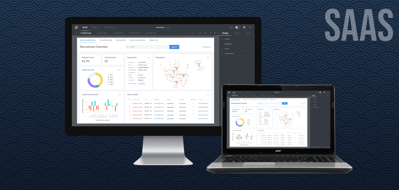
Redesigning a no code app creation platform to be used by a large non-coder audience through simplifying user workflows, new design system and enhanced features.
About
The platform has a history of 7 years of organic evolution and has been mostly used across the globe by government institutions, and by the corporates.
The project was organised into workstreams that covered the different modules of the platform.
Project Objective
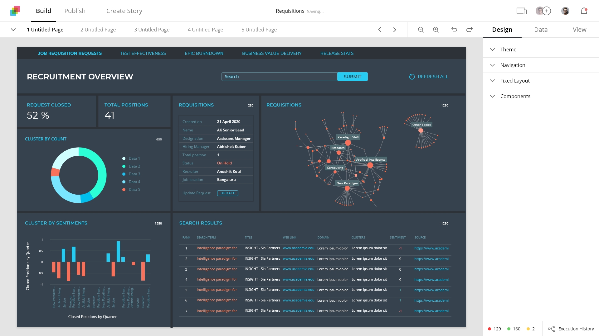
The objective of the project is to revamp the platform to empower the Author(*person creating App) with set of tools and flows to create Apps, Dashboards and Automation through Self service, Intelligent experience and Guided help.
Understanding the product
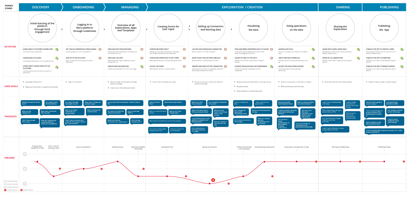
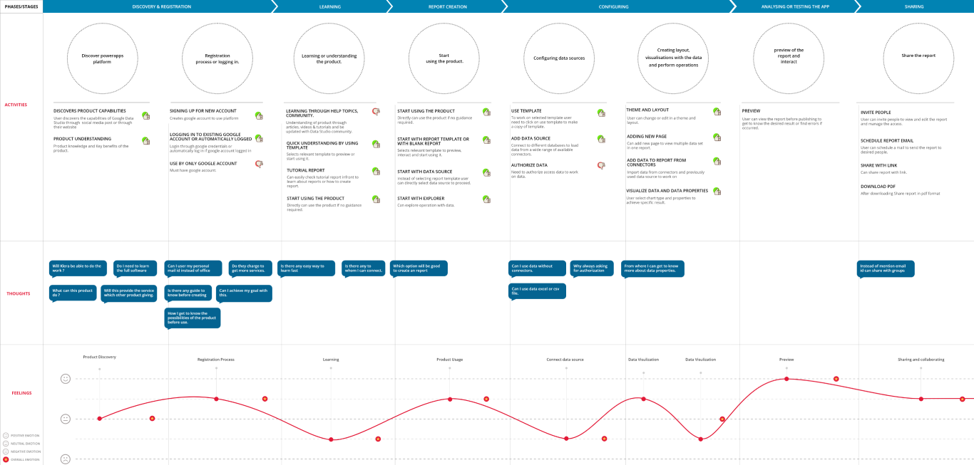
User journey map
Mapping the user journey of the person creating an App.
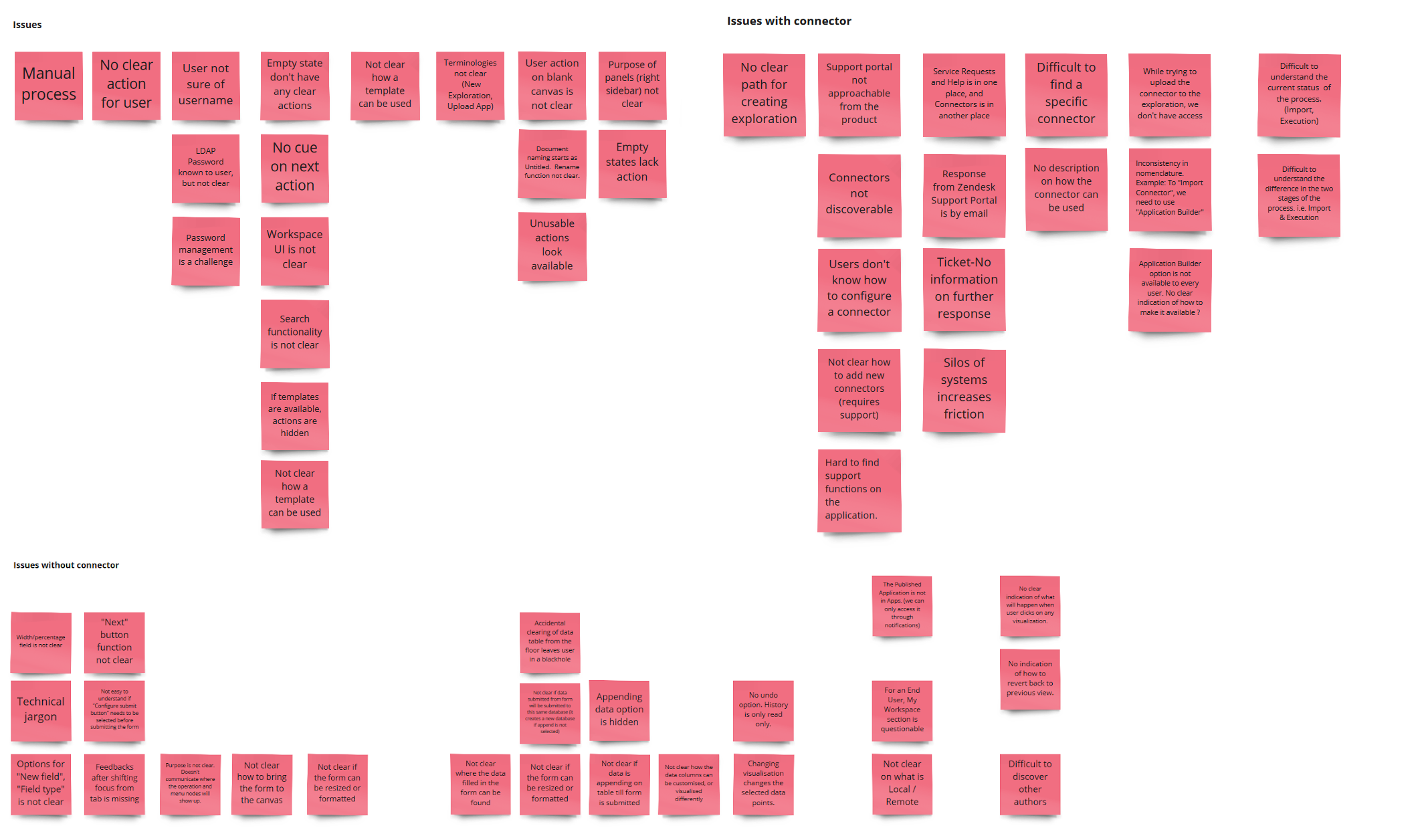
UX Audit
Identified UX issues in the current platform under different scenarios of onboarding, data connection, app creation etc.
Users
Identified persona, based on the platform usage.

Author
who creates the app in collaboration with other authors and publishes it for the end-users to consume

End user
who consumes the Apps created by the Author
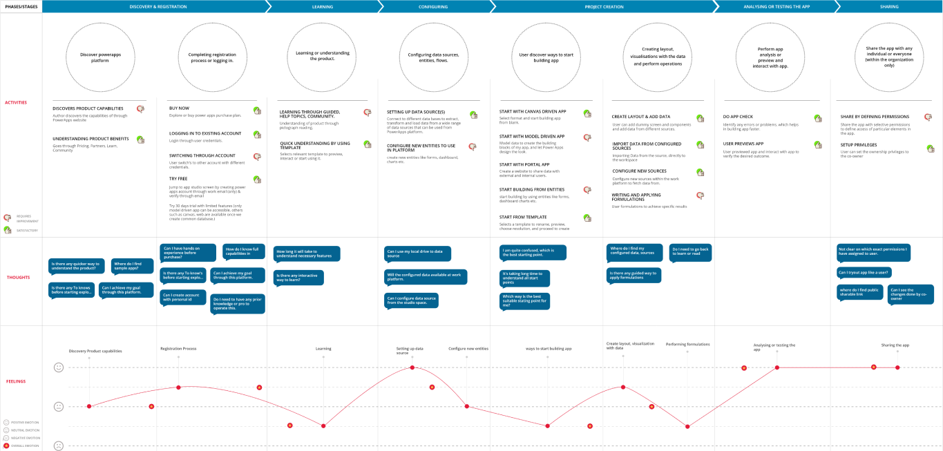
Substitute products
There were no direct competitors to our platform, but we were able to identify 2 substitutes that offer almost similar features.
We mapped and compared their user journey.
Microsoft PowerApps
Google DataStudio
Another comparison involving different aspects of the products.
| Parameters | MS PowerApps | Google Datastudio | Our product |
|---|---|---|---|
| Connector Visibility | ★ ★ ★ ✩ ✩ | ★ ★ ★ ★ ✩ | ★ ★ ✩ ✩ ✩ |
| Data & UI Elements Discoverability | ★ ★ ★ ★ ✩ | ★ ★ ★ ★ ✩ | ★ ★ ✩ ✩ ✩ |
| Data Operations discoverability | ★ ★ ★ ✩ ✩ | ★ ★ ★ ✩ ✩ | ★ ★ ★ ★ ✩ |
| Ease of 5 min Journey | ★ ★ ★ ✩ ✩ | ★ ★ ★ ★ ✩ | ★ ★ ✩ ✩ ✩ |
| Highlights | Organised resource management | Easy customization | Real-time read-write to Datasource |
Product vision
Envisioned User Journey
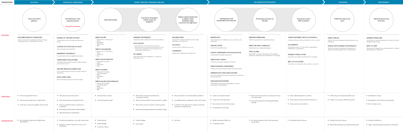
Envisioned state
The platform will leverage intelligent experience which understands Author’s intent and expertise, and provides functionalities ranging from full control to total assist.
All the functionalities will be exposed
Author is empowered with all the controls
- Data connectors controls
- Operations controls
- User controls
Initial handholding and system assistance
New user will be onboarded progressively
- Coachmarks and guides for navigation
- System assistance with recommendations
First 5 minute Journey
The first 5 min journey for a new user was the basis to achieve the envisioned objectives
Onboarding
Sign Up
Sign In
Learning the platform
Set up project
Create Project
Create an App
- using datasource connector
- using template
Create Dashboard
App creation
App details
Choose theme
Configure Layout
Create visualisation
Run operations
Configure Datasets
Execution history
Wireframes
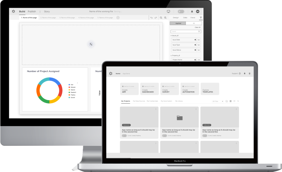
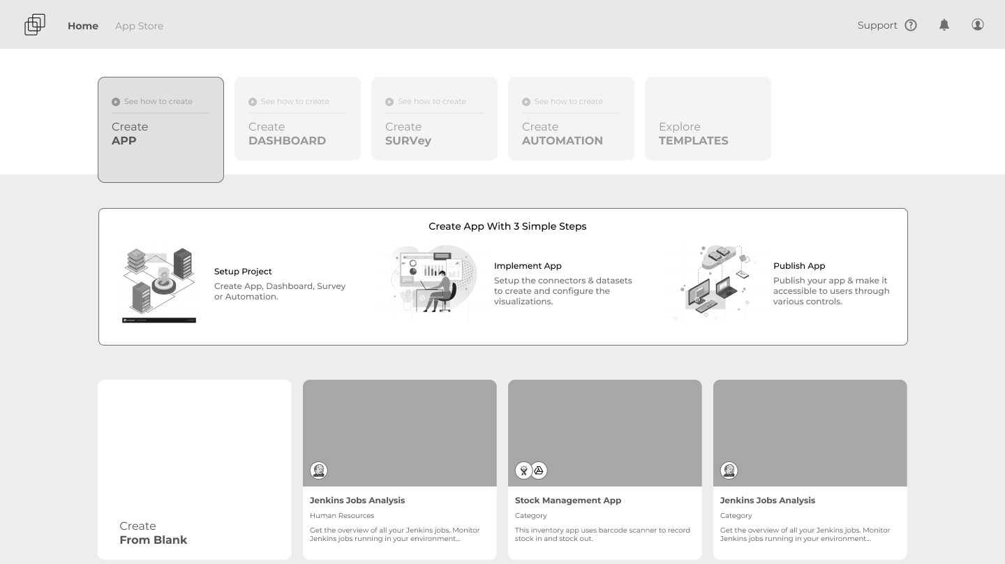
Home
Appstore
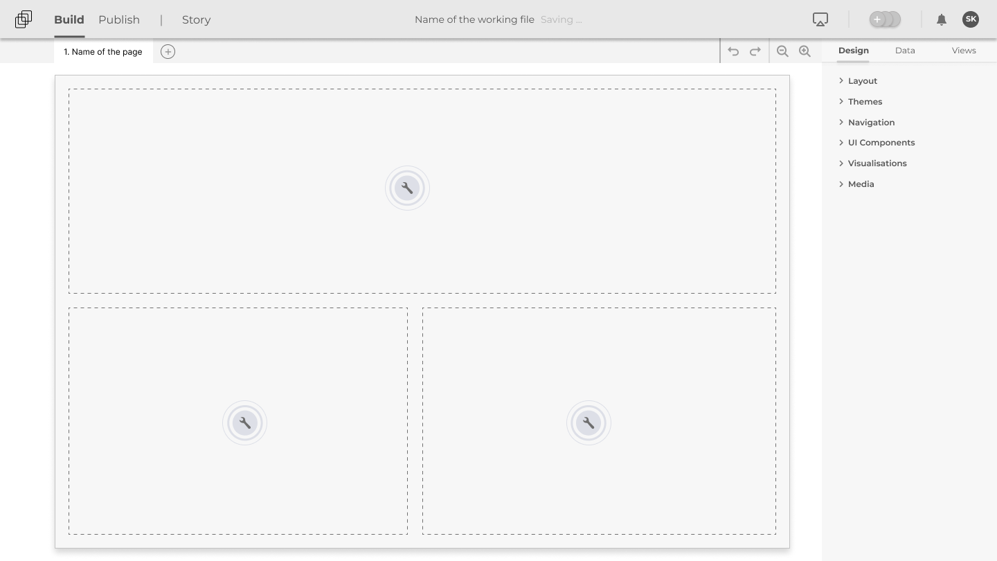
Floor - design panel
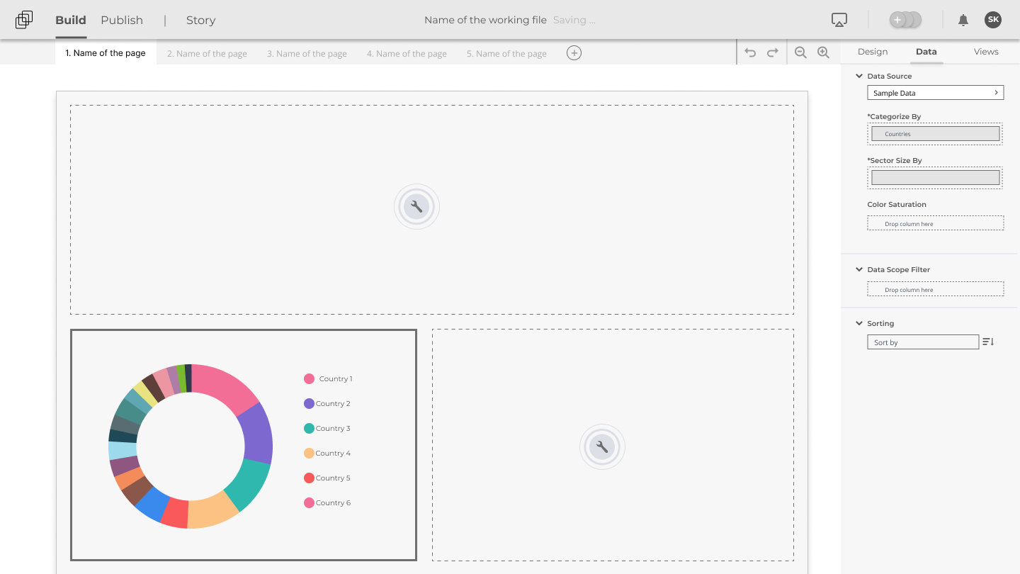
Floor-data panel
Design system
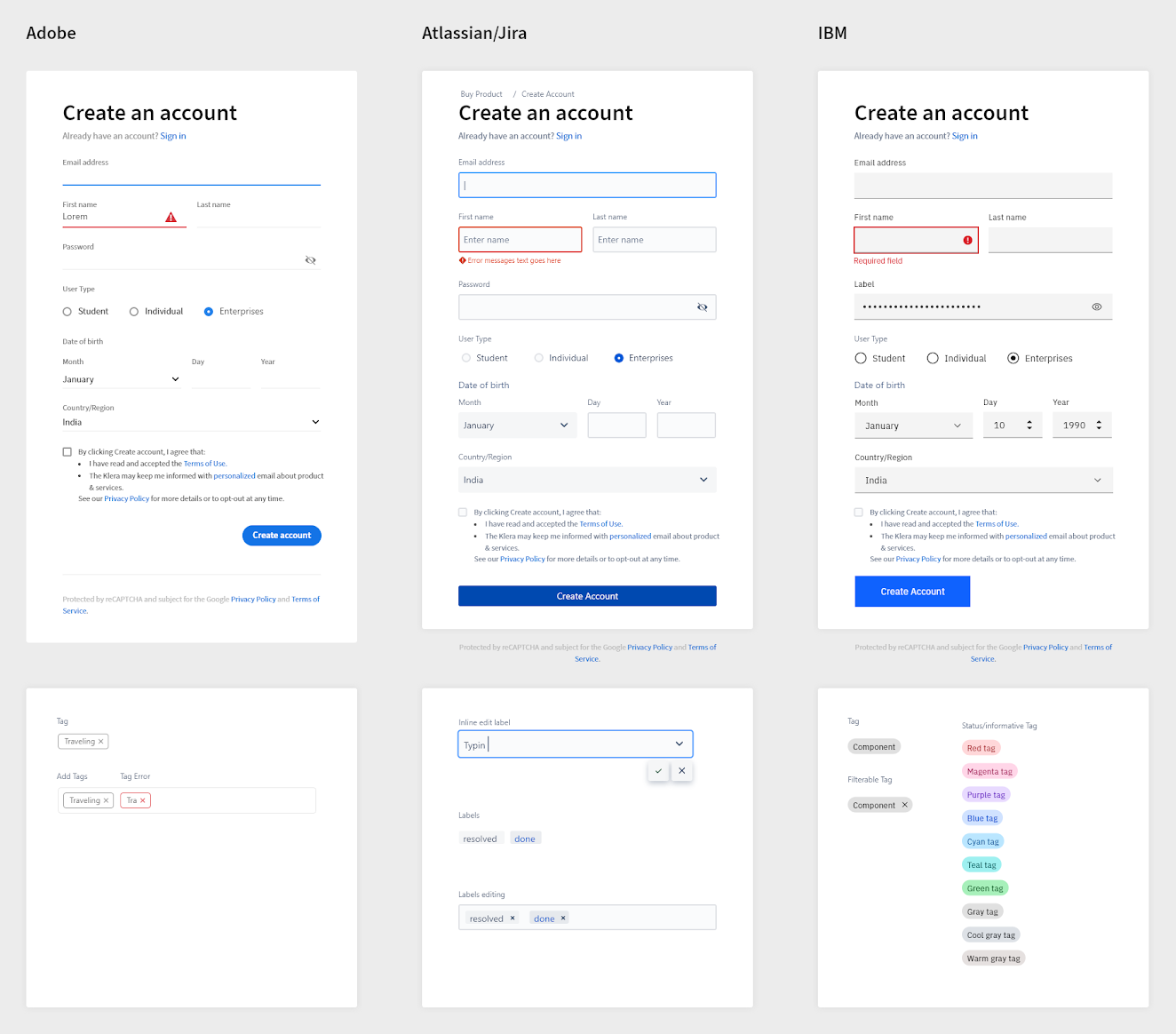
Exploring existing design systems
Documented design systems are studied to collate a comprehensive list of UI components. To discover other important attributes (like relative spacing and alignment of components) some of the UI components were examined, and a layout has been derived to compare how the same components render across different platforms.
Philosophy
Building blocks
Building blocks that fit together-based on the platform's innate purpose i.e. a building ground.
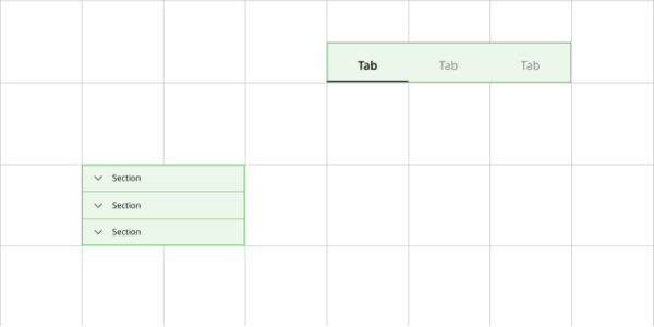
Hierarchy
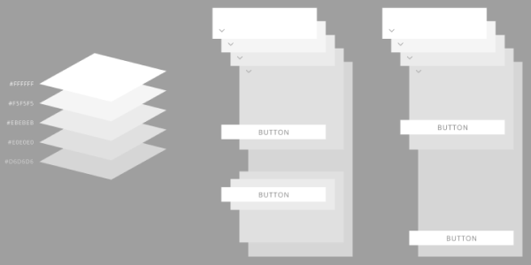
Panels are layered with a logical color grading to denote hierarchy.
Colors
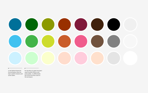
Neutral color for the UI elements so as to go along with any theme on the floor. Green was the ascent color of the platform.
Typography
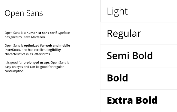
Open Sans was chosen as the primary typeface, because of legibility, and ease on eye for prolonged usage.
Iconography
Minimal line icons, thin outlines and no shadows.
Workspace
Workspace should be subtle so that the author can focus more on the Floor.
Themes
Visually enticing Apps are now possible with easy-to-use design panel.
Outcome
Optimized elongated and complex processes
Various processes had unnecessary dependencies and roadblocks.
- We simplified the flows and made them user-centric.
- Bring forward the functionalities to make them easily discoverable
- New features like a virtual assistant to provide contextual help were added
New design system
The lack of a common visual language created confusion in the workflow.
We created a new design system "Klarity" that will
- Bring harmony to the product in its various aspects
- Be used as a tool by the author to create beautiful apps for the end user.
Easy data connectivity
Connecting to data required technical knowledge and complete dependency on the administrator
- Connectors tray made it possible to use data sources as one works on the Apps
- By introducing the data sources tab at home it became easier to manage all the data sources
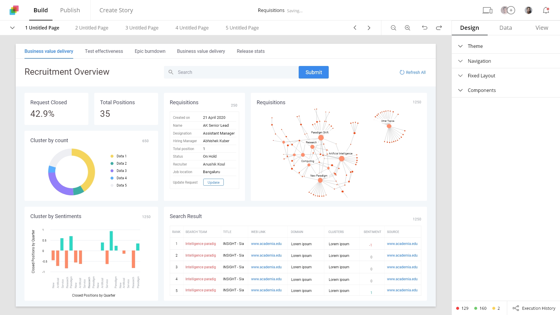
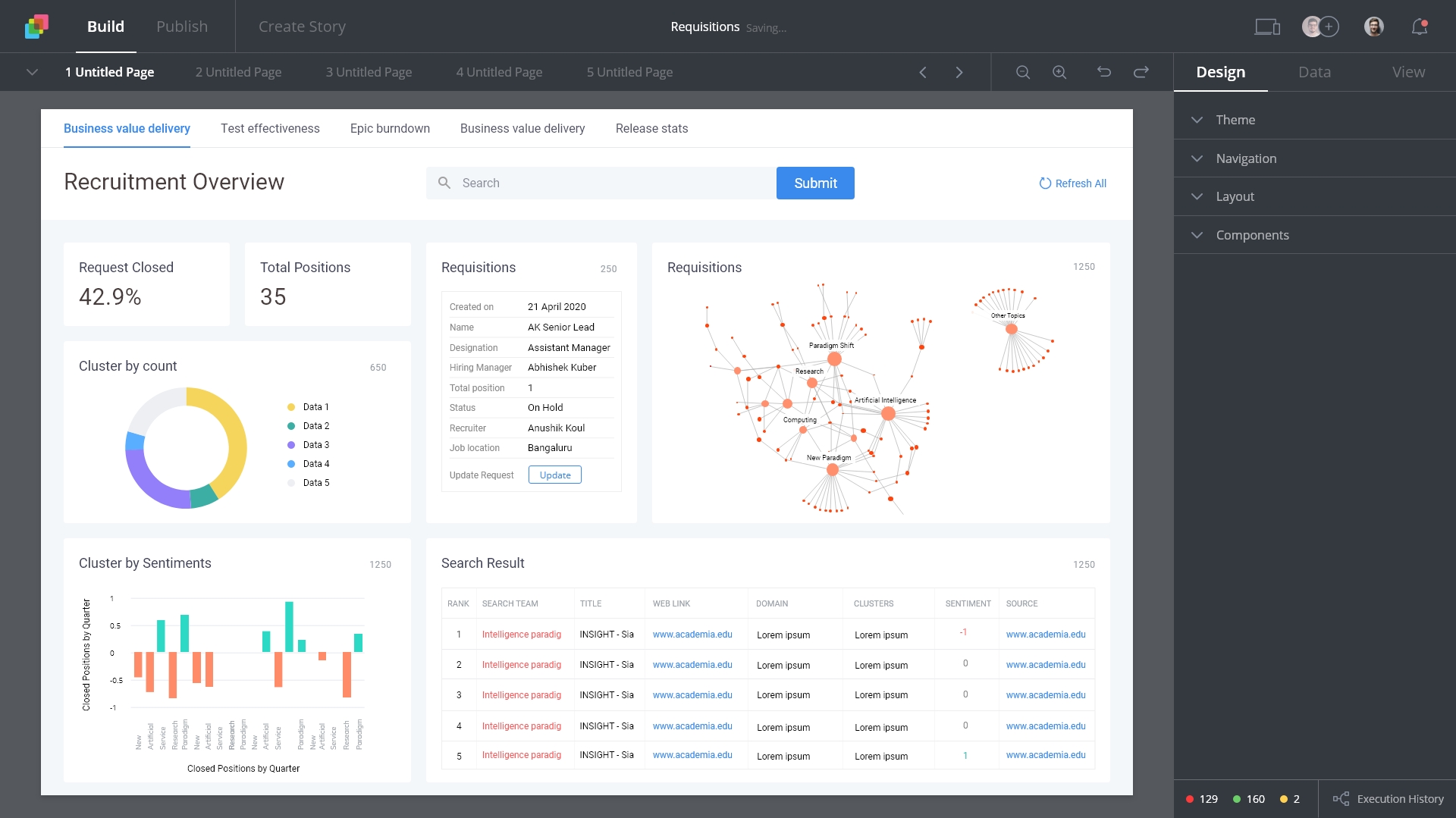
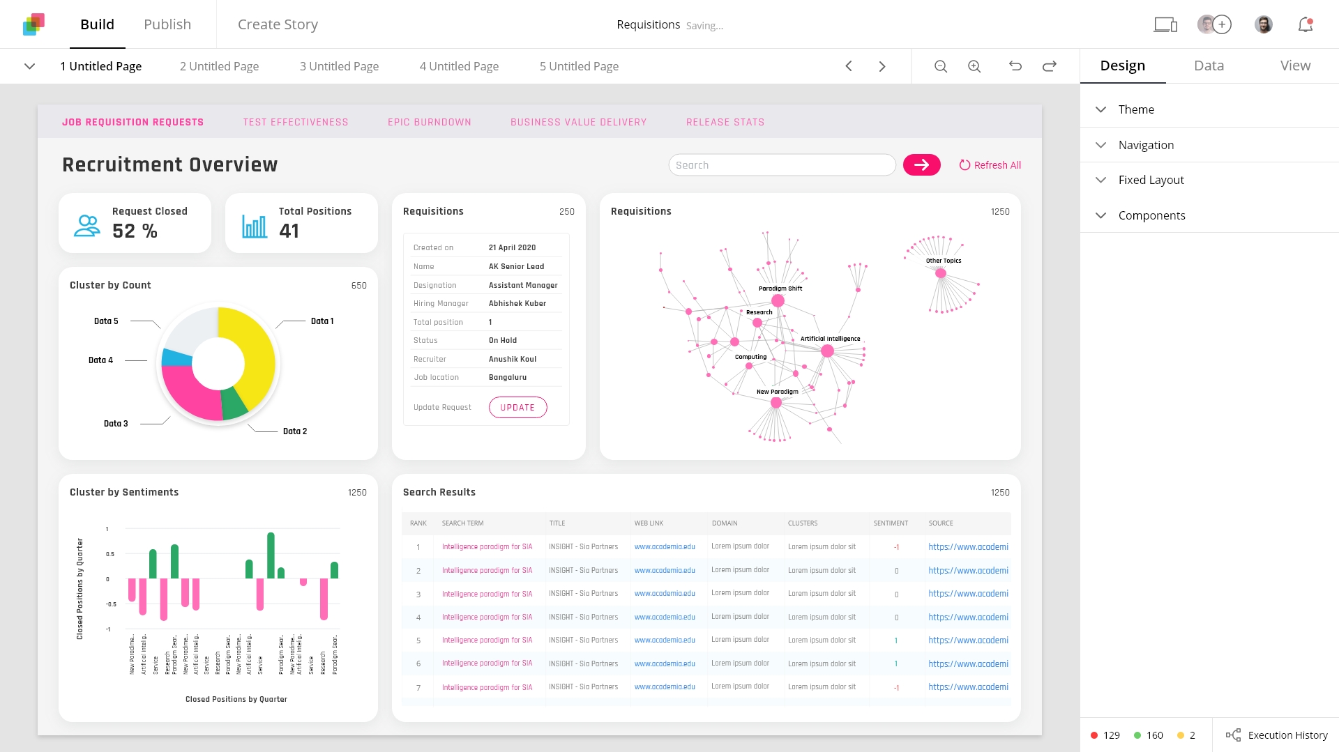
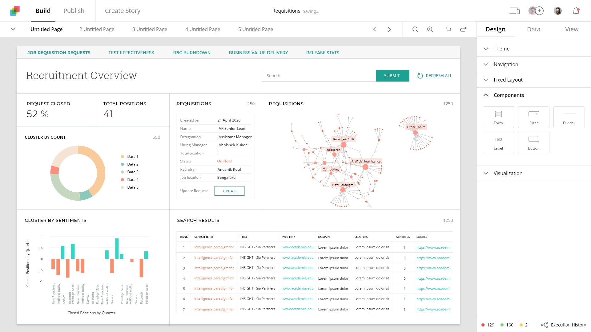
Powerful Execution graph
The execution graph has the potential that was not earlier explored in its entirety.
The new design of the execution graph added new layers for alerts, pages and visualisations and elegantly represents their interconnections
Home - Improved resource management
With the advent of new functionalities, there arose a challenge of managing the assets.
Klera home gave the capability to create, modify and manage the various resources, on any device
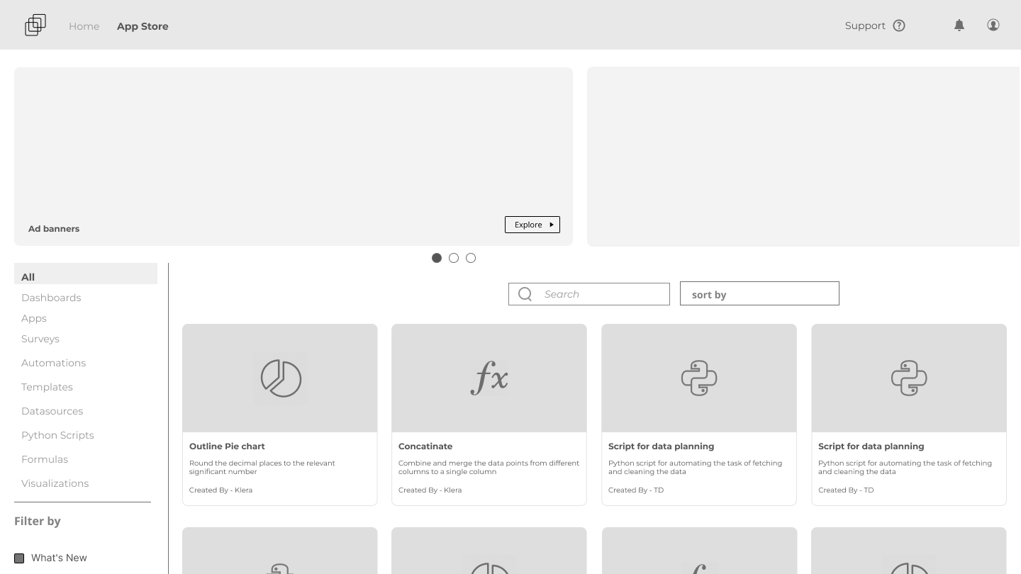
Appstore - new marketplace for the assets
Appstore will be a one-stop shop for all the various resources and assets required to create an App. Users will be able to upload their creations too.
Takeaway
The immense level of complexity and technicality taught me to pay attention to details, learn on the go and also apply as one learns.
- The biggest takeaway for me was to always look at the larger picture and plan as much in advance. It saves a lot of time and money.
- For technical skills, Learnt about design systems, data visualisation, BI Tools, no-code app creation platforms, data connectors, process and system flows, and SAAS products.