
Project information
- Category: Heathcare
- Client: Happily health
- Role: Project Lead & manager, UX Researcher
Project Brief
Usability study for a health app to investigate rapid drop in user registration.
About
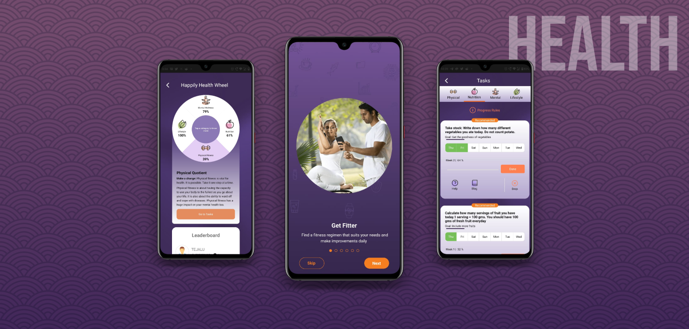
Happily Health is a step by step guide to holistic healthy living. It uses scientifically proven recommendations based on one's health assessment, to help them improve in different areas including physical fitness, mental, and emotional well-being, nutrition, and lifestyle.
Since the launch of the App in Oct 2020, it was observed that the users were dropping-off at a high rate.
Objective
The objective of the study is to identify the problematic areas in the App, that were supposedly turning the users away from the App.
Research
Research participants
The participants criteria included:- Health enthusiasts- anybody who does exercise/yoga regularly either daily or once in 3 days, and is diet consciuos.
- Have used at least one health App.
Fitness devotee
Wants to follow workout and diet plans to push their limits.
Health keeper
Wants to follow workout and diet plans to maintain a good health.
Demography
New Delhi 1F
Bhopal 1M
Chandrapur 1F
Pune 1F
Bangalore 2M
Total 6 Participants 3 Male | 3 Female
3 Health devotee 3 Health keepers
Age groups
Age 26-35 3
Age 36-45 2
Age 46-50 1
Research Method
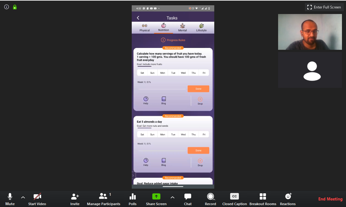
Looking at the need of the hour, and budget and time constraints, we choose remote moderated testing and interview for the study.
Remote interviews
50-60 min
Remote moderated testing
15-20 min
Interviews
Both the interviews and usability testing were conducted and captured (*with consent) through "Zoom".
Although a script was losely followed to cover the necessary questions, but further questions were asked to know details on specific topics whenever required.
Analysis
Interviews were transcribed. Themes and patterns were identified and later sorted on Miro board.
A 3-level report was prepared.
Screen-wise comprehensive analysis

HH wheel

Tasks

Healthopaedia

Groups
HH wheel
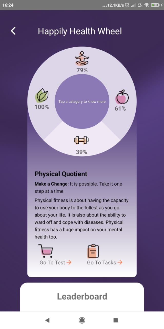
Issues
- Missing Score calculations info
- Misleading iconsUI design
Can’t relate the category scores to the average score
Critical- Problem with tapping iconsDevelopment
User thoughts
do I need to rotate the wheel
Where is my position in leaderboard?
Advice is same in all categories
Features analysis
Outcome
It was observed that the App features were indeed very useful, but it lacked user-friendly implementation.
- The App lacked intuitive flows as there are certain portions that were complicated for simple tasks.
- There were confusing visual cues that lead to user frustrations.
- The visual language of the App also appeared outdated to some of the young participants but was not a problem with elder participants
As a health App that intends to collect sensitive health data from its users, it becomes necessary to build trust. To achieve this the various aspects of the App should speak a friendly language.
Takeaway
This project brought up new challenges and learnings, both in terms of technical as well as managerial grounds
- Leads can be converted without proposals, provided a convincing work backgroud.
- Recruiting the participants takes one to a whole new level of experience, especially when asking remotely that too regarding health during the times of pandemic.(*faced tough times finding right participants)